Luxury Automotive
Email Review
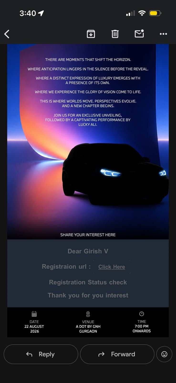
“An Exclusive Unveiling & Performance by Lucky Ali”
Kopi AI analysis from August 13, 2026
The email successfully establishes a premium, mysterious atmosphere through high-quality visual assets and an exclusive value proposition. However, it suffers from critical conversion blockers, including severe legibility issues in the registration section and unprofessional typos. Fixing the low-contrast 'Registration' block and replacing text links with prominent buttons should be the immediate priority.
Email Screenshot
Quick Wins
- Fix the spelling of 'Registration' and 'your interest' to restore brand trust.
- Change the 'Click Here' text to a bright white or gold button to drive clicks.
- Increase the font size and contrast for the recipient's name to enhance the feeling of exclusivity.
Priority Actions
- Redesign the 'Registration url' section with a high-contrast background and a proper CTA button.
- Break up the hero text block into a short headline and a small, readable paragraph to improve scannability.
- Ensure all functional text (links and personalization) meets high-contrast accessibility standards to prevent user drop-off.
Category Breakdown
Detailed Feedback
Hero Impact
55/100The silhouette of the vehicle with glowing headlights creates a strong sense of mystery and luxury, perfectly aligned with an 'exclusive unveiling.'
Visual Hierarchy & Layout
40/100The bottom 'logistics' bar is cleanly organized with icons for Date, Venue, and Time, making the 'where and when' easy to find.
CTA Strength
25/100The phrase 'SHARE YOUR INTEREST HERE' acts as a secondary signpost for engagement.
Message Clarity & Tone
30/100The tone is appropriately aspirational and exclusive for a high-end luxury event.
Offer & Value Proposition
75/100The combination of an exclusive vehicle unveiling and a live performance by a well-known artist (Lucky Ali) is a high-value draw for the target audience.
Content Structure & Flow
60/100The flow follows a classic 'Atmosphere -> Personalization -> Action -> Logistics' sequence.
Readability & Scannability
35/100The footer logistics (Date/Venue/Time) are very easy to scan at a glance.
Personalization & Audience Fit
80/100Using the recipient's name ('Dear Girish V') immediately signals that this is a curated invitation.
Color & Contrast Notes
- The grey text on the dark grey registration background fails basic legibility tests; it is the most significant blocker in the email.
- The white all-caps text over the blue/orange glow is legible, but the line spacing is tight, creating a 'wall of text' effect.
- The footer icons and text have excellent contrast (white on black), making this the most functional part of the email.
- The car silhouette is effectively used, but the lack of an accent color for the CTA button makes the overall palette feel too 'flat' for a conversion-oriented asset.
Want to Create Better Emails?
Use Kopi AI to generate professional, on-brand marketing emails that convert. AI-powered email creation in seconds.